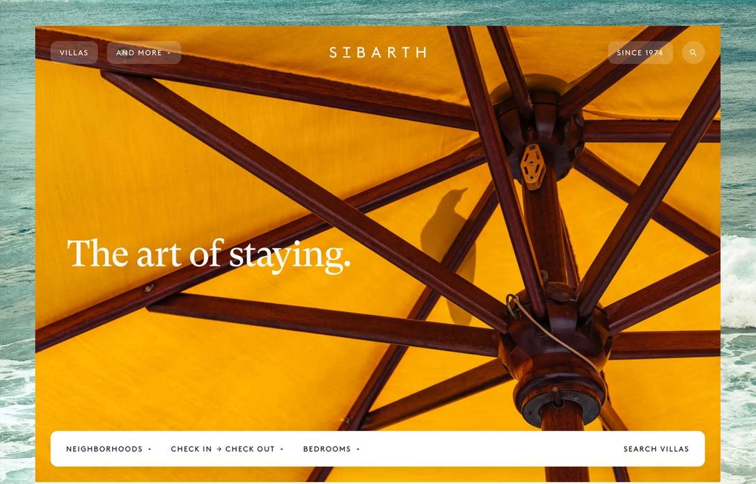
Beyond theme-color: tricking Safari into animating its address bar
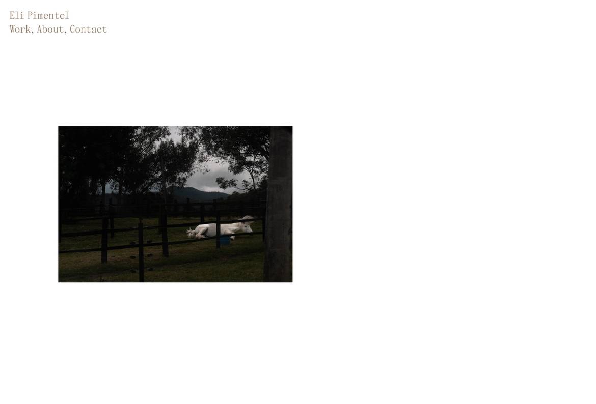
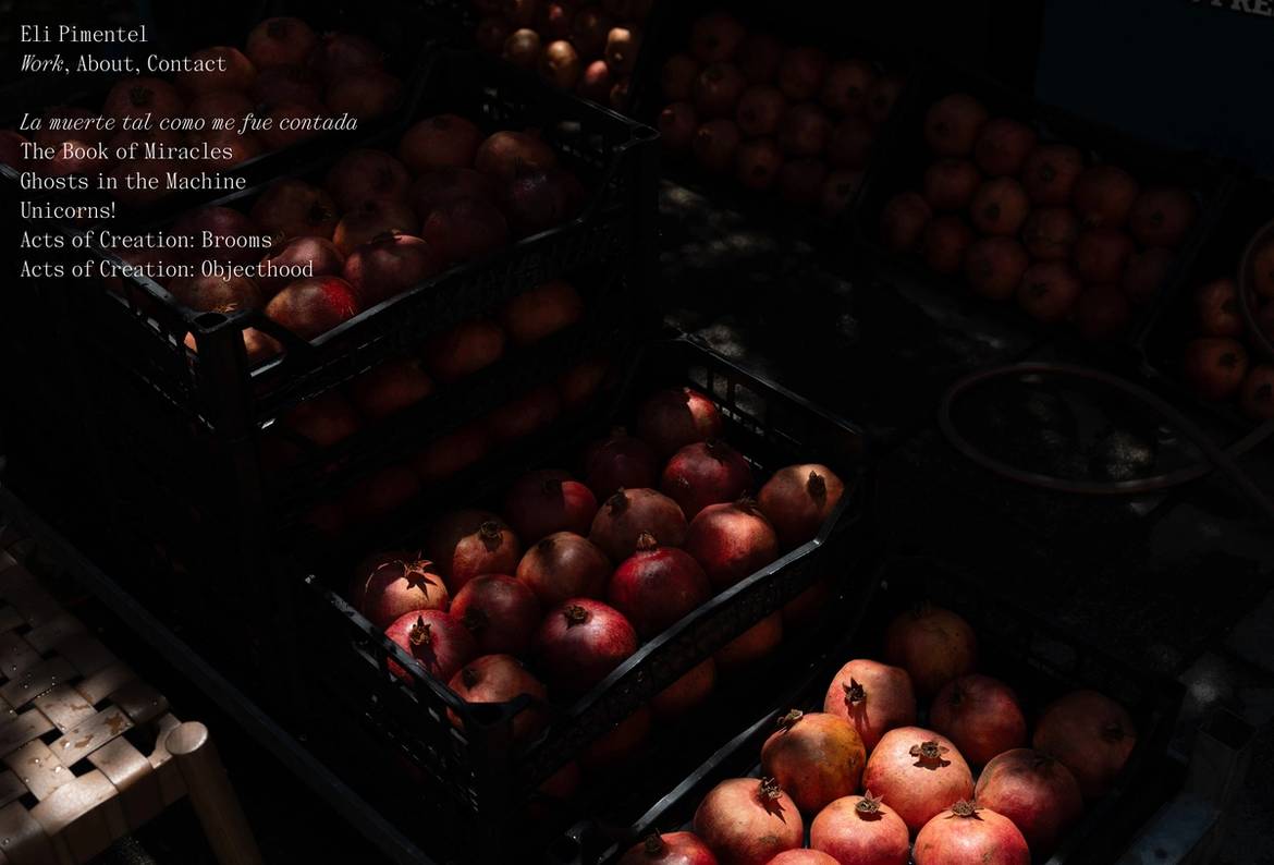
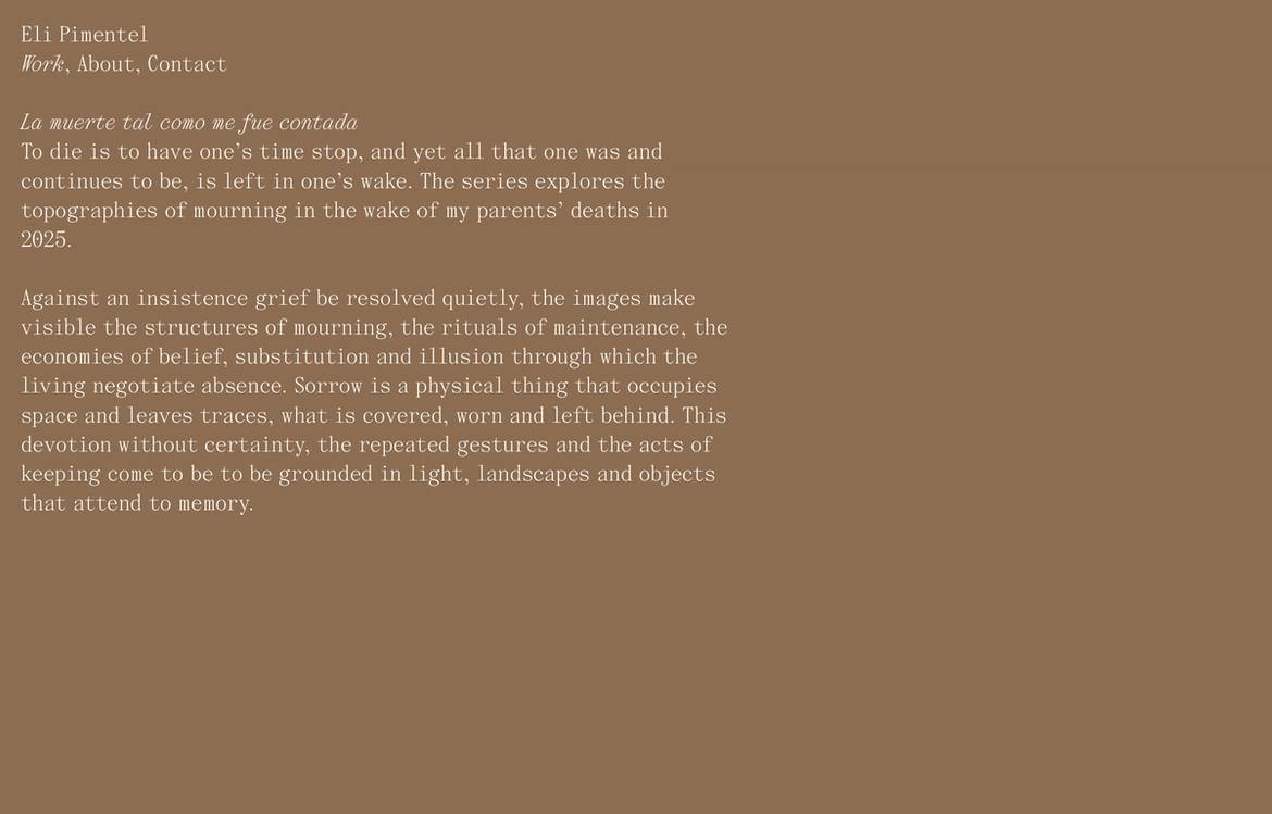
Eli Pimentel’s website is a photography portfolio built on five page templates. The three that matter here are the white homepage with a photo sequence, the index of works with full-bleed photos as backgrounds, and the individual work page—a slideshow where the first slide with the project text has a copper background, while the photo slides that follow return to white.
We focused on this sequence because it is the primary path through the site: Homepage > Works > Single Work.
Nuxt is our framework of choice. Because it runs as a Vue single-page application, the header stays mounted across navigations, and route transitions work natively.
A basic fade transition requires a global CSS rule:
.page-enter-active,
.page-leave-active {
  transition: opacity 300ms ease;
}

.page-enter-from,
.page-leave-to {
  opacity: 0;
}
and is activated in nuxt.config.ts:
export default defineNuxtConfig({
  app: {
    pageTransition: { name: 'page', mode: 'out-in' },
  },
});
Because we also fade in images during lazy loading, the transition from the homepage to the works index moves from white to black before the photograph loads. It creates a smoother visual rhythm, but one detail breaks the effect: the browser chrome stays locked to its previous color while the page underneath changes.
Browser UI tinting
In 2021, Safari 15 introduced "compact tabs", an alternative layout combining open tabs and the address bar into a single row. Alongside it came "Show color in tab bar", a setting that blended the browser chrome with the background of the active web page. It had limitations, but when configured properly, it made web apps feel cohesive.
The background was either derived automatically from html and body, or set manually with a meta tag:
<meta name="theme-color" content="#ffffff" />This behavior remained largely unchanged between Safari 15 and Safari 18 on both desktop and mobile. While Chrome on desktop never adopted browser chrome tinting, Chrome on Android respects the same meta tag (and uses it for PWA splash screens).
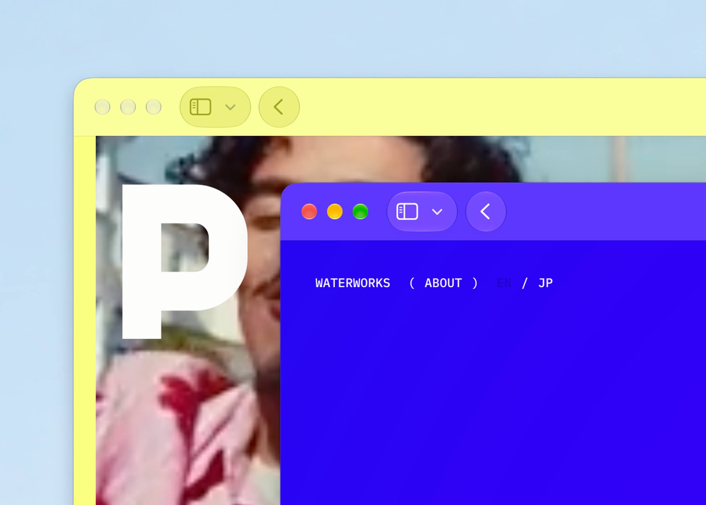
In our setup, tinting extends the page background into the browser interface, though with two constraints: Safari supports only a single solid color (no gradients or full-bleed photos), and it does not provide an API to animate transitions between colors across route changes.
Some web apps experimented with modifying the meta tag dynamically. This let developers turn the address bar red on an error state, or build stepped animations by rapidly cycling hex values through JavaScript intervals.
Starting with Safari 26, Apple changed the sampling model entirely. The browser stopped relying on <meta name="theme-color"> for the window chrome and started inspecting DOM elements directly. On iOS, Apple introduced full-screen scrolling alongside an automated tinting behavior that samples fixed elements near the top ("forehead") and bottom ("chin") of the viewport. During page navigation, this heuristic frequently broke, especially when fixed overlays used transparency or gradients.
While Apple refined the heuristics in Safari 27, the underlying mechanism remained: Safari samples fixed elements. We can use that exact mechanism to coordinate tab tinting directly.
An invisible fixed sampler
Safari ignores the theme-color meta tag for its UI chrome and inspects the topmost element in the viewport instead. To qualify for sampling, that element must meet specific conditions:
- Use
position: fixedorposition: sticky. - Sit within 4px of the top of the viewport (or 3px of the bottom on iOS).
- Measure at least 90% wide on macOS (80% on iOS) and at least 3px high.
- Have an opaque or non-zero background-color.
The sampler must be a real DOM element (Safari does not reliably sample pseudo-elements), and you should avoid backdrop-filter or opacity tricks. Keep keyed theme-color tags in the document head as a fallback for older browsers and Android.
Here is our sampler element:
<div class="safari-tint" aria-hidden="true"></div>.safari-tint {
position: fixed;
top: 0;
left: 0;
width: 100vw;
min-height: 4px;
background-color: var(--page-background);
visibility: hidden;
pointer-events: none;
transition: background-color 450ms ease;
}Notice visibility: hidden. Safari samples the background of hidden elements as long as they participate in page geometry. A rule like display: none pulls the element from the render tree, preventing sampling entirely. Avoid opacity: 0, as Safari may sample the transparency and introduce muddy tint artifacts.
Because this element transitions its background color via a CSS variable, Safari's sampling engine picks up the color changes frame-by-frame, creating a smooth tab bar transition between pages.
The full Nuxt implementation
To manage this across pages, we centralize the theme logic in app/layouts/default.vue. The layout checks the current route, determines the active theme, sets inline background colors on html and body as an initial fallback, and updates the fallback meta tags:
<template>
  <div>
    <div class="safari-tint" aria-hidden="true"></div>
    <WebsiteHeader />
    <NuxtPage />
  </div>
</template>

<script lang="ts" setup>
interface AppTheme {
  className: string;
  themeColor: string;
  colorScheme: string;
}

const route = useRoute();

const appTheme = computed<AppTheme>(() => {
  const routeName = route.name?.toString() ?? '';
  const routePath = route.path.replace(/\/$/, '') || '/';

  if (['work-slug', 'works-slug'].includes(routeName) || /^\/works?\/[^/]+/.test(routePath)) {
    return { className: 'app-theme-work-detail', themeColor: '#8C6D51', colorScheme: 'dark light' };
  }

  if (['work', 'works'].includes(routeName) || ['/work', '/works'].includes(routePath)) {
    return { className: 'app-theme-work', themeColor: '#000000', colorScheme: 'dark light' };
  }

  return { className: 'app-theme-index', themeColor: '#ffffff', colorScheme: 'light dark' };
});

useHead(() => ({
  htmlAttrs: {
    class: appTheme.value.className,
    style: { backgroundColor: appTheme.value.themeColor },
  },
  bodyAttrs: {
    class: appTheme.value.className,
    style: { backgroundColor: appTheme.value.themeColor },
  },
  meta: [
    { key: 'color-scheme', name: 'color-scheme', content: appTheme.value.colorScheme },
    {
      key: 'theme-color-light',
      name: 'theme-color',
      media: '(prefers-color-scheme: light)',
      content: appTheme.value.themeColor,
    },
    {
      key: 'theme-color-dark',
      name: 'theme-color',
      media: '(prefers-color-scheme: dark)',
      content: appTheme.value.themeColor,
    },
  ],
}));
</script>
In global SCSS, define the theme custom properties on html, override them via the route class names, and transition only paint properties:
body,
html {
  min-height: 100%;
  background-color: var(--page-background);
  color: var(--page-color);
  transition:
    background-color 450ms ease,
    color 450ms ease;
}

html {
  --page-background: #ffffff;
  --page-color: var(--color-copper);
  --header-color: var(--color-copper);
  color-scheme: light;
}

html.app-theme-work,
html.app-theme-work body,
body.app-theme-work {
  --page-background: #000000;
  --page-color: #ffffff;
  --header-color: #ffffff;
  color-scheme: dark;
}

html.app-theme-work-detail,
html.app-theme-work-detail body,
body.app-theme-work-detail {
  --page-background: var(--color-copper);
  --page-color: #ffffff;
  --header-color: #ffffff;
  color-scheme: dark;
}

header {
  color: var(--header-color);
  transition: color 450ms ease;

  a {
    color: inherit;
  }
}

@media (prefers-reduced-motion: reduce) {
  .page-enter-active,
  .page-leave-active,
  .safari-tint,
  body,
  html,
  header {
    transition: none;
  }
}
Confining this setup to the root layout keeps individual page components decoupled from browser-specific quirks. Adding a new route style only requires mapping its path to a theme class and hex value in `appTheme`; the CSS variables, page transitions, and fixed sampler handle the synchronization automatically. If you test this in your own project, make sure to check physical iOS hardware—desktop Safari’s responsive design mode does not accurately replicate address bar sampling or scroll-tinting behavior.