Making extreme climate data accessible and explorable
The website designed by Cinzia Bongino for IFAB makes a section of the European Extreme Events Climate Index (E3CI) data publicly accessible—offering a clear, dynamic overview of major weather-related hazards experienced across European countries. Over 40 years of data, made available with minimal loading times.
- We partnered on
- Design consultancy, Frontend + backend development, Server management
- Design
- Cinzia Bongino
- Year
- 2023

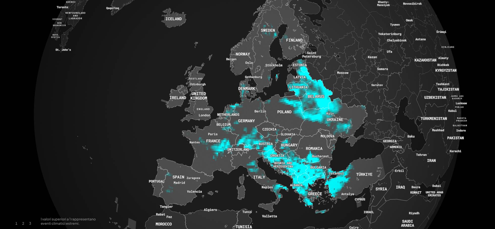
eventi climatici estremi.
European Extreme Events Climate Index (E3CI) è una suite di indicatori che ha l’obiettivo di restituire informazioni sulla frequenza e severità degli eventi meteorologici considerando le sette dinamiche: temperature estreme massime e minime, siccità, precipitazioni estreme, grandine, incendi e venti estremi.


European Extreme Events Climate Index (E3CI) è un insieme di indicatori che vengono aggiornati mensilmente e forniscono informazioni sulla frequenza e la gravità degli eventi meteorologici estremi in Europa. Ispirandosi agli Indici climatici sviluppati in Nord America (Actuaries Climate Index), l'E3CI esamina le sette componenti climatiche attraverso degli indicatori che sono utilizzati come «proxy» degli impatti associati. I valori superiori ad 1 identificano le anomalie e sono considerati critici, pertanto sono correlati a eventi climatici estremi.
Temperatura massima estrema
Somma dei valori di temperatura massima per mese al di sopra del 95° percentile calcolato, giorno a giorno, su finestra mobile di 5 giorni.
Temperatura minima estrema
Somma (valore assoluto) dei valori di temperatura minima per mese al di sotto del 5° percentile del valore calcolato, giorno a giorno, su finestra mobile di 5 giorni.
Siccità
Standardized Precipitation Index deviazioni standard per cui il valore del cumulo di precipitazione su 3 mesi si discosta dal valore climatologico normalizzato sullo stesso trimestre
Precipitazioni estreme
Cumulo del valore giornaliero di precipitazione in eccesso al 95° percentile calcolato su scala mensile.
Grandine
Calcolato l’indicatore Significant Hail Parameter SHIP (usato dal servizio meteorologico NOAA per misurare la propensione allo sviluppo di fenomeni grandinigeni), si calcola il cumulo del valore in eccesso rispetto alla soglia utilizzata per l’allerta.
Venti estremi
Calcolato l’indicatore di letteratura Local Loss Index (Klava & Ulbrich, 2003) funzione del cubo della velocità massima giornaliera del vento, si valuta il cumulo mensile dell’indicatore per i giorni in cui la velocità del vento massima supera il 95° percentile del valore mensile.
Incendi
Calcolato l’indicatore Fire Weather Index (usato dal servizio canadese per misurare la propensione all’innesco di incendi), si calcola il cumulo mensile del valore in eccesso rispetto alla soglia associata al rischio elevato di innesco.
Media dei componenti
Media dei valori di tutti i sette indicatori per i singoli fenomeni: un unico dato che restituisce quanto un determinato mese sia climaticamente estremo a prescindere dalla tipologia di fenomeno verificatosi.

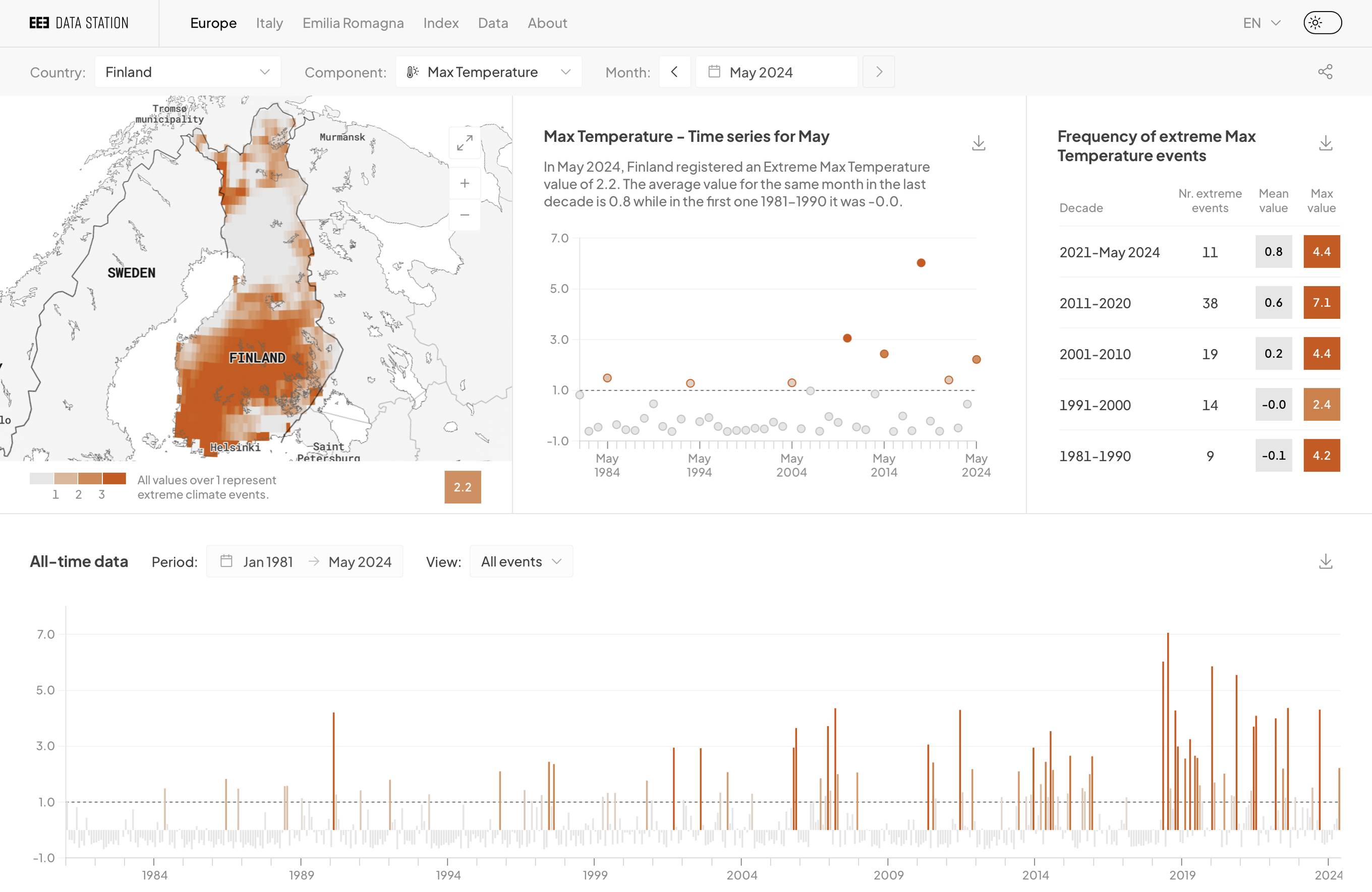
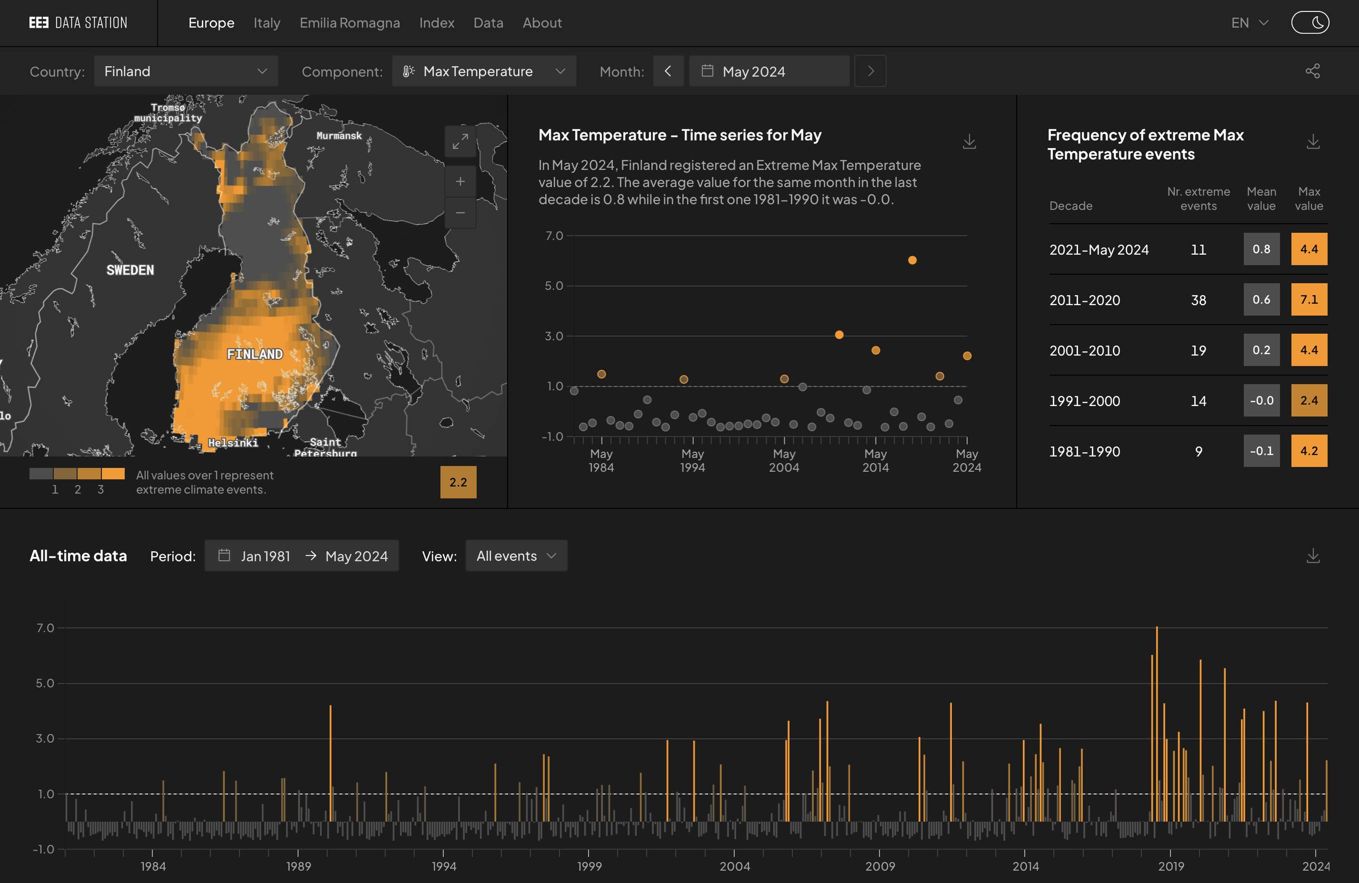
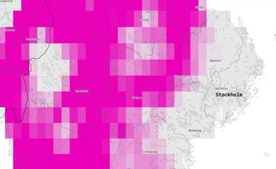
Implementing a dynamic theming system
The platform offers eight different “views” of the climate index, each defined by its own colour identity. To support this, we established a global theming system: a centralised set of design tokens connected directly to the designer’s Figma file. These variables drive the entire interface—every page background, every chart, every tooltip, and legend responds not only to the selected data view but also to the user’s light or dark mode preference.
The result is a user experience that feels visually coherent and context-aware, whether you’re browsing in sunlight or presenting in a dark lecture theatre. The theme defaults to the user's system settings but can be manually overridden at any time.

| Decade | Nr. extreme events | Mean value | Max value |
|---|---|---|---|
| 2021-May 2024 | 1 | -0.4 | 1.2 |
| 2011-2020 | 3 | -0.3 | 4.2 |
| 2001-2010 | 8 | -0.1 | 2.6 |
| 1991-2000 | 12 | -0.0 | 3.8 |
| 1981-1990 | 15 | 0.1 | 4.0 |


Preparing data behind the scenes
A platform this data-rich could easily become heavy. To avoid loading gigabytes of information into the browser, we moved the entire data-processing pipeline server-side. The frontend’s sole responsibility is to display.
Behind the scenes, a custom Python script runs monthly, transforming raw climate data into hundreds of pre-compressed JSON files. Each file is structured for fast lookup and streaming into Mapbox or chart components. Nothing is downloaded until it’s needed—keeping the interface light, fast, and stable, even when dealing with data from over 40 years of climate extremes.
Every visualisation was developed in close collaboration with Federica Guerrini, climate data scientist at CMCC, to ensure scientific accuracy at every stage of interaction.

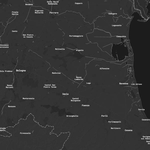
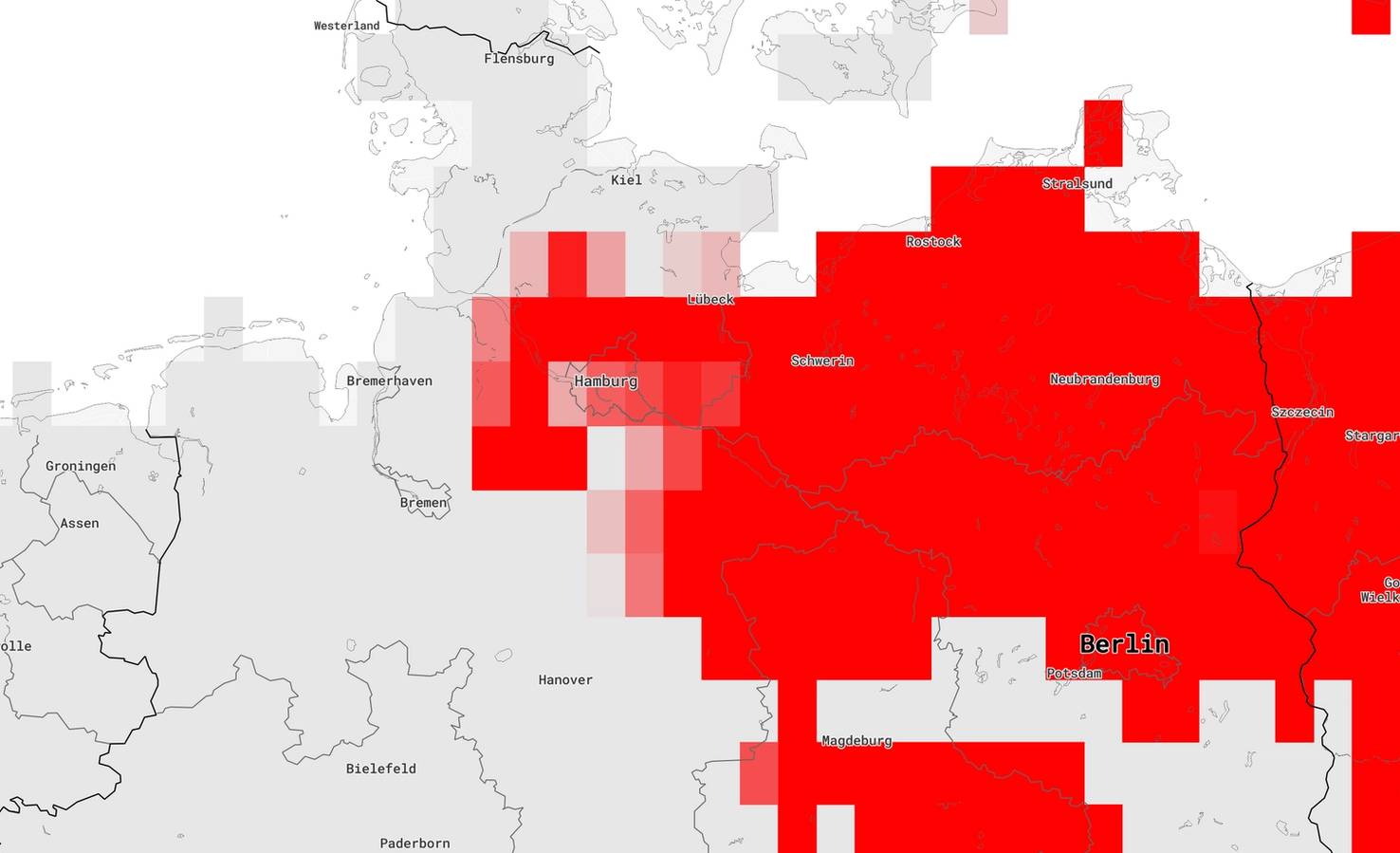
A single map instance, everywhere
Mapbox was our choice for all map-related features, thanks to its flexibility, strong theming support, and developer-friendly API. Rather than instantiating a new map on every page—a common but costly approach in terms of performance and API usage—we built the platform around a single, persistent <MapboxMap/> component.
This setup, made possible by Nuxt 3’s component architecture, allows us to reuse the same map instance across multiple views. The result: faster transitions, less data fetching, and smoother animations. The bulk of processing happens during the initial load; from there, the experience remains fast and fluid.


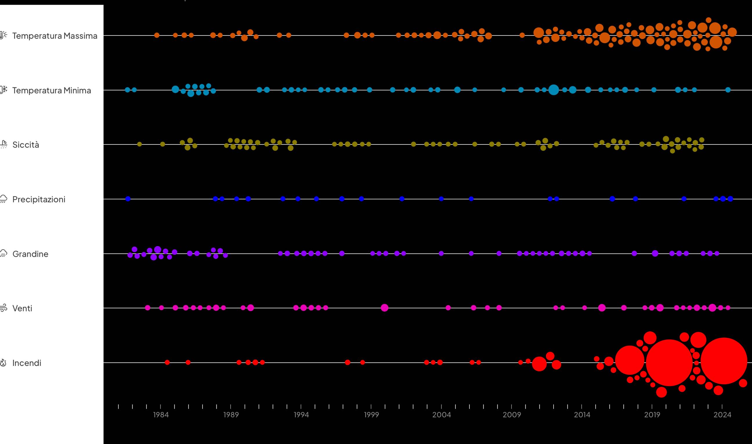
Rendering interactive charts client-side
We implemented four types of charts—a plot, a bar chart, a heatmap, and a beeswarm—each rendered in the browser, on the fly, using raw JSON data and chart.js.
Client-side rendering provides two key benefits. First, it ensures maximum responsiveness: charts adapt fluidly across screens, from desktop monitors to mobile devices. Second, it allows real-time redraws when the data changes—without reloading the page or fetching new assets.

L’indice E3CI (media delle componenti) restituisce informazioni sulla frequenza e severità degli eventi meteorologici in Austria considerando le sette dinamiche: temperature estreme massime e minime, siccità, precipitazioni estreme, grandine, incendi e venti estremi.


Built to be shared, embedded and reused
The platform isn’t just for browsing—it’s designed for communication. Regularly used by the CMCC (Centro Euro-Mediterraneo sui Cambiamenti Climatici) team in talks, reports, and newsletters, it needed to support both static and interactive outputs.
We developed a custom export function that allows users to save any chart or map as an image—directly from the browser, without relying on pre-generated assets. When interactivity is required—for example, embedding a map in a newsletter or live presentation—each page includes a lightweight, embeddable version with minimal UI, accessible via the share menu.


E3CI is a project by IFAB (International Foundation Big Data and Artificial Intelligence for Human Development). Implemented by Euro-Mediterranean Center on Climate Change (CMCC), Leithà Gruppo Unipol. Distributed by Hypermeteo, and Radarmeteo.
UX/UI design, data visualisation: Cinzia Bongino, with the supervision of climate data scientist Federica Guerrini.
Frontend: Nuxt 3, Pinia, Naive UI, Mapbox
Backend: Node.js, Python, Pocketbase